Nokia · Nokia Design System · 2025
Helping designers get answers from the design system, not from a person
Research into how Nokia's designers actually use their design system documentation, and a proposed new structure and page template built around the questions they come with.
Led the research end to end
Jun – Oct 2025
A shared kit of parts, used by product teams across Nokia
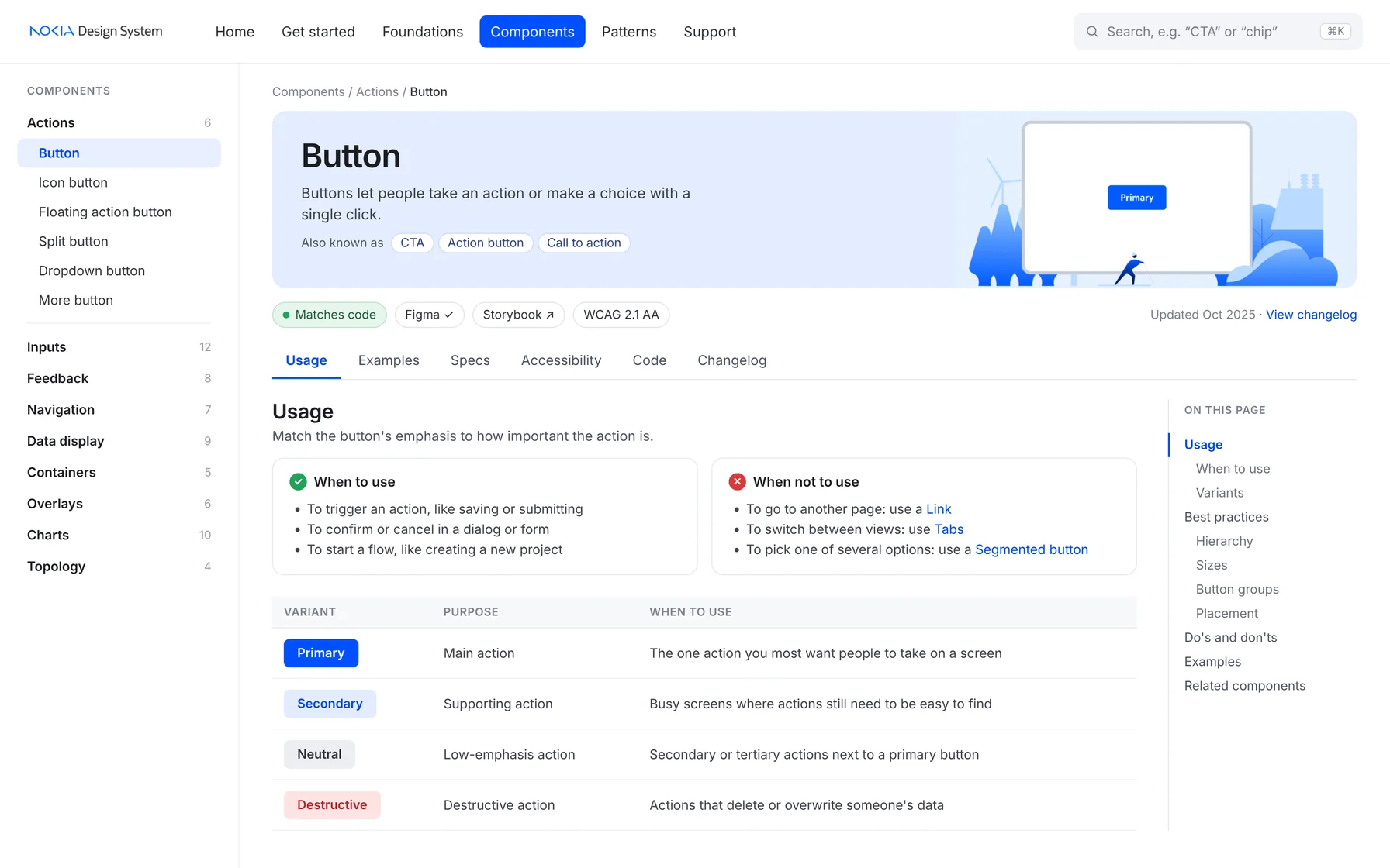
The Nokia Design System (NDS) is the set of buttons, tables, charts and rules that Nokia's network software is built from. Think of it as a box of building blocks plus the instruction manual. Designers get the blocks in Figma, read the instructions on the documentation site, and developers pull the matching code from Storybook.
How might we make the documentation the first place designers go for answers, instead of the last?
The manual existed, but designers still had to ask a person
NDS was preparing its documentation for an eventual public release. The pages had been moved over from older tools, and the team suspected they were too long and too technical, but nobody knew what designers actually needed from them.
Every question that ends up in the NDS team's inbox is time away from improving the system, and a designer waiting instead of designing.
I looked at the docs from four angles
First how the best public design systems do it, then how ours was organized, then what designers told us at scale, and finally why, one conversation at a time.
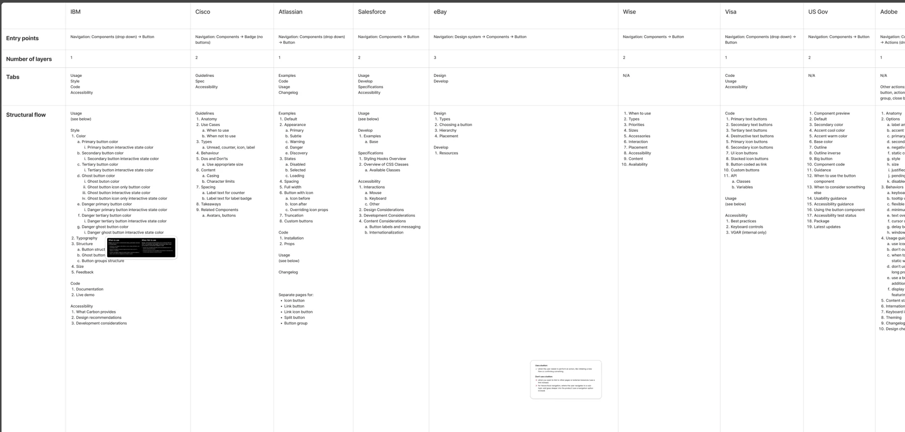
- JUNE · BENCHMARKCompareHome, foundation, component, pattern and accessibility pages from 17 public design systems, including IBM Carbon, Atlassian and Salesforce
- JULY · MAPMapTreemaps of NDS, the Nokia Brand Hub and Storybook, flagging every gap and mismatch
- AUGUST · SURVEYMeasureA 20-question survey I wrote on when, where and how designers use the docs, sent company-wide
- OCTOBER · INTERVIEWSUnderstand9 sessions with 11 designers across product teams to explain the numbers
Designers don't read the docs. They check them.
Nobody sits down to read about a button. They arrive mid-task with one question, and leave in under five minutes.
Docs are a quick check, not a read
15 of 16 open the docs to check how a component behaves or when to use it. Most spend five minutes or less on a page.
When sources disagree, trust breaks
If the docs, Figma and the code showed different things, designers stopped trusting all three and messaged a person instead.
You can't search for a name you don't know
A "chip" in one team is a "tag" or "badge" in another. Inconsistent names and groupings made the right page hard to find.
The surprise: in interviews, the "Get started" section sounded like something nobody opened. The survey showed 69% had used it, mostly while onboarding. Pairing both methods kept us from cutting a page people relied on once, but really needed.
That password didn’t work. Try again, or email me for access.
The solution, key decisions, process and impact are behind this. Email eelisabethlau@gmail.com for the password.