cartd · Founding Product Design · 2024
From a creator's recipe to a full grocery cart in a few taps
I was cartd's only designer, tasked with building the web app that could win its first partnership with a food creator who has 2M+ followers: a branded page where followers cook, shop and subscribe.
Sole designer, end to end
Remote, London startup
Design a web app that can secure cartd's first partnership with a creator who has 2M+ followers, one that earns money from their content and shows off everything they offer.
A young startup, a big creator, and not much time to get it right
cartd is a London startup that helps food creators turn their followers' interest into groceries in a cart. When someone sees a recipe they like, they can add its ingredients to a supermarket cart without writing a shopping list. My job was to design what the followers and the creator would actually use.
So every screen had to do two jobs: make cooking and shopping easy for followers, and give the creator ways to earn and show off their work.
One page for a creator's fans, with a shop built into every recipe
Here is the whole idea in one flow. The creator shares a link, followers land on her page, and the recipe turns into a cart.
Cook the recipe without the shopping-list chore
Swap ingredients for ones they prefer
See cost and leftovers before buying
Send the whole recipe to one cart
Join live cook-alongs and comment on recipes
A branded home that earns and shows off her work
A subscription (£3 a month or £30 a year) for exclusive content
A pantry and store to feature products
Live events on Instagram, YouTube and in person
A community in the comments
A recipe, then a shopping list
The recipe is the cart
A creator page that takes followers from discovery to checkout
I designed a mobile web app that opens right from the creator's link, so followers never have to install anything. It has four areas, each with its own set of features.
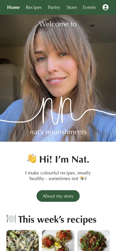
About the creator
Recipe browsing and filters
Serving size and units
Nutrition information
Ingredient swaps
Leftovers and cost
Reviews and comments
Product pages and offers
Tesco cart
Checkout and payment
Subscription and billing
Log in and sign up
Profile and saved recipes
Three decisions shaped the experience
One button turns a recipe into a grocery cart
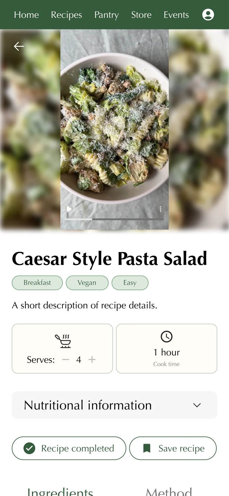
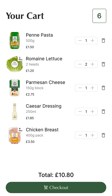
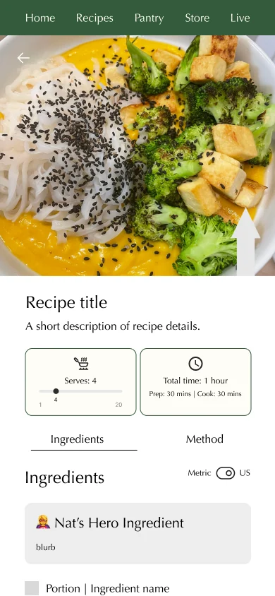
Followers decide what to buy while they read the ingredient list, so that is where the cart button lives. Swaps come first, for anyone who needs a different ingredient. Then one button sends everything to a Tesco cart, which keeps things simple: items, quantities, one total, one checkout.
Show what a recipe costs, and what's left over, before anyone buys
Ingredients are sold in bigger packs than most recipes need, so a jar of mustard or a bag of cashews mostly goes unused. Each recipe shows its cost per person, total cost and how much will be left over. Below that, the creator's other recipes that reuse those leftovers, so the next meal is one tap away.
Live events that give people a reason to subscribe
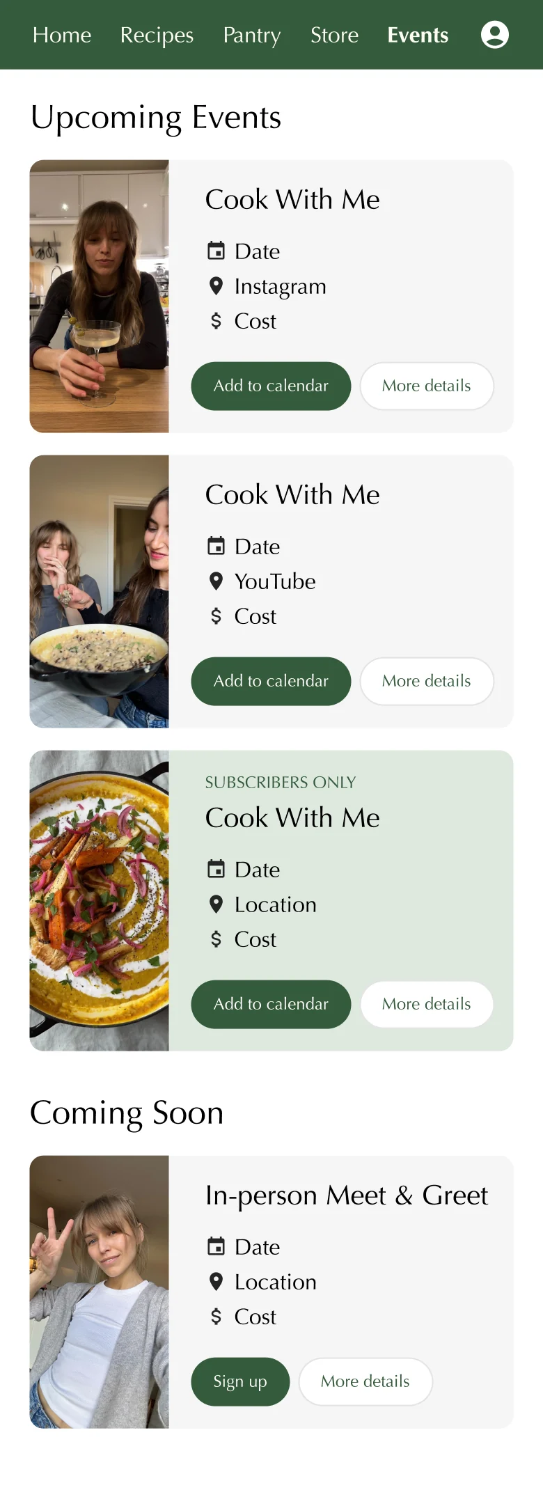
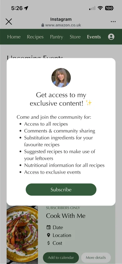
The creator's cook-alongs and meet-ups sit on one events page, split into upcoming and coming soon. Each card has a date, place and cost, plus an "Add to calendar" button. Subscriber-only events get their own colour, and a short pop-up shows what a subscription unlocks.
Three quick rounds, shaped by the creator's feedback
Time was short and access to the creator was limited, so I worked in rounds and sorted each batch of changes into "essential" and "nice to have".
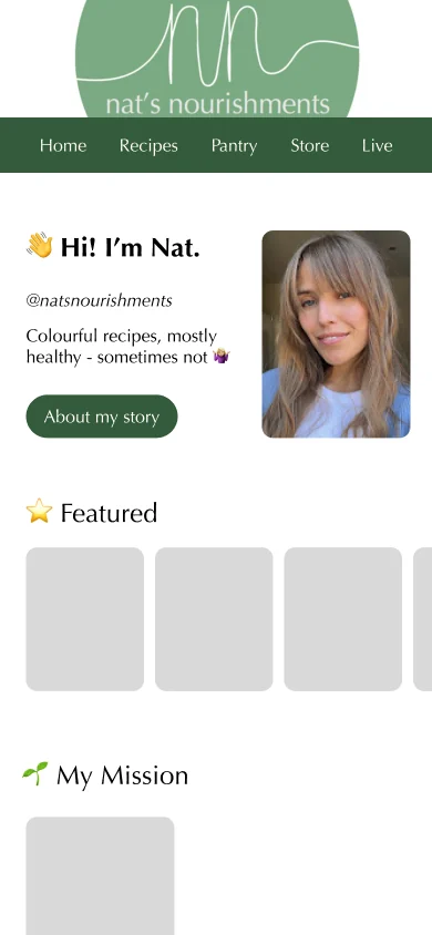
- ROUND 1StructureWireframes for home, recipes, pantry, store and events, with grey placeholders
- ROUND 2Essential vs nice to haveThe recipe page filled out with swaps, nutrition and comments
- ROUND 3Launch changesFinal changes for the creator's launch: paywall, sign-up flow and profile
10+ features, a faster launch and better creator conversion
What I'm taking with me
Design for two audiences at once
Followers want a quick shop. The creator wants income and a way to show her work. Every screen had to earn its place for both.
Make every round of feedback count
With limited access to the creator, clear before-and-afters and a split between essential and nice-to-have kept decisions quick.
Hand off as if developers are the next users
As the only designer, I documented flows and screens so the team could build without waiting on me.